Identity and site design for a warm take on financial services.
Both personal and creative, the Ronin Society is taking on financial services with a gentle, empathetic touch––creating a sense of intimacy in a historically impersonal industry.
Creative Direction Meryl Vedros
Site Development Alexander Page

Wordmark

Color palette, secondary logo mark
All brand expressions had a warmth filter. All expressions must convey the sense of warmth and depth we sought––vibrant, warm, sophisticated, approachable.


Site typography, grid, colors: Elegant typography in conversation with a simple grid and minimal illustrations.


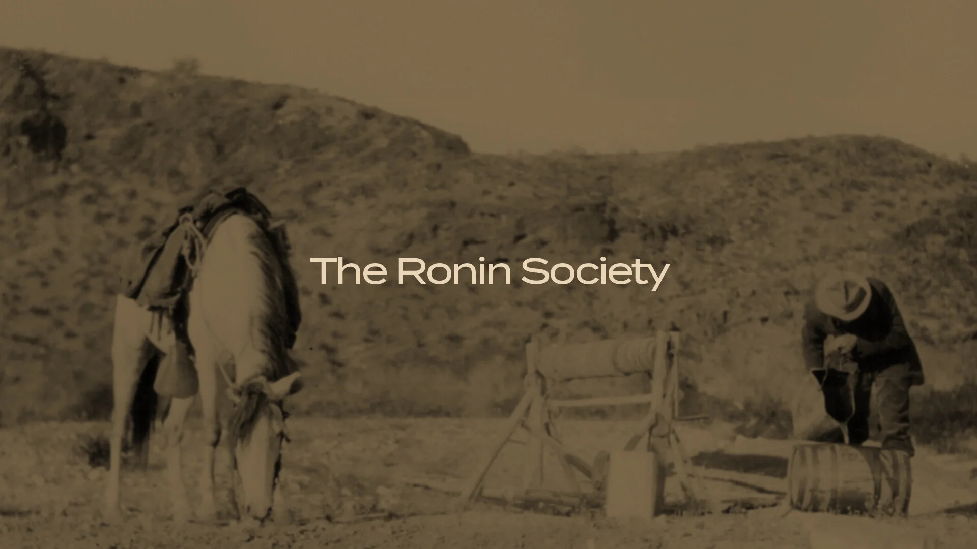
Imagery is treated with the same filter to enforce cohesion across all platforms.


Site design